Wednesday, December 19, 2012

Apple's Memory Storage Rip-off


What is the true cost of memory? According to Apple, it's very expensive. The iPhone, iPad and iPad mini come in 3 memory storage capacities: 16GB, 32GB and 64GB. The devices are otherwise identical. The table below shows the pricing of the iPad for each capacity:


Apple's on-cost for increased memory is consistant across all the device ranges:
16GB --> 32GB: $100.00 equivalent to $6.25/GB
32GB --> 64GB: $100.00 equivalent to $3.13/GB

However, if we look at the cost of SanDisk Memory Cards, the on-cost is much less (from Amazon.com):
16GB --> 32GB: $10.00 equivalent to $0.63/GB
32GB --> 64GB: $30.00 equivalent to $0.94/GB


This is an incredible rip-off! Based on the above, Apple is charging 1,000% more for the step up from 16GB to 32GB than SanDisk do on Amazon.com. And I'm not even using the sales prices quoted on the site. I know this is not the most accurate way to calculate what memory actually costs, but I don't have access to Apple's BOM. I also have enough understanding of marketing to understand that products are sold at what the market will accept, and that product range steps are artificially created to create demand. However, I personally think that $100.00 for 16GB or even 32GB is way more than it needs to be.

Thanks for reading.

Thursday, December 6, 2012

The Digital Land Grab

Apple have often been criticised for their closed ecosystem; the so-called "walled garden" that discourages cross-platform inter-operability. However, developing an ecosystem where the hardware and software is strictly controlled and designed to work together, and where different devices seamlessly connect and interact,  has paid off for Apple, and Microsoft and Google are quietly developing ecosystems of their own. The table below shows the devices each company has developed in an effort to take over your digital life.


 I could have included other companies, like Samsung and Sony, but they mostly run licensed operating systems on their devices. There is a certain degree of cross platform inter-operability between these devices. For example, there is an iOS app that gives remote functionality for the Google TV, and it is still possible to run iTunes on a Windows machine, and thus stream video to an Apple TV via AirPlay.  Apple tends to develop proprietary standards, making it impossible, for example, to stream video from an Android device to Apple TV. Apple does this for 3 reasons:

  1. Security - Apple is very careful about allowing other devices to connect to its ecosystem, thus preventing viruses from spreading.
  2. The Halo Effect - Building on its huge iPhone user-base  Apple can promote their complimentary devices which further enhance the user experience.
  3. Licence fees - Apple can collect licence fees from hardware manufacturers looking to incorporate features like AirPlay into the devices.

Google takes an almost opposite view, and promotes the use of open standards which allows other hardware manufacturers to easily build devices that interact with each other within the Google ecosystem.
The reason for this is because Apple and Google have very different business models. Apple make premium hardware devices, and make their profit from the huge margins they charge. On the other hand, Google make most of their profits from advertising, and anything that gets people online is to their advantage. However, this seems to be changing. With the success of the Nexus 7 tablet, and more recently the Nexus 4 mobile phone, Google are reportedly looking into sourcing their own Chromebooks to complement those already made by Acer and Samsung.

Microsoft is traditionally a software company, and except for the Xbox, their previous attempts at hardware have ended in failure. Both the Zune (mp3 player) and Kin (phone) were short-lived. With the Surface, Microsoft are making an aggressive attack on the tablet market. Time will tell if they are successful or not, but Microsoft are worried. They are seeing their traditional business being eroded from one side by Google, and from the other side by Apple. Google are offering free web-based alternatives to the MS Office Suite, and the Chromebook could eventually challenge their dominance in the PC market. At the same time, Apple's iPad is being seen as an alternative in the post-PC era, and there are many productivity apps in the App Store that also eventually offer an alternative to Office. The Apple Mac is also showing some growth in an otherwise shrinking market. Microsoft therefore feel they have to develop their own ecosystem, and try and find new profit channels like apps from the Windows Store, and subscription services like Office 365.
This 3-way battle is essentially a land grab, because all 3 companies will try and lock users into their respective ecosystems. Apple is leading at the moment, Google has the most flexibility, and Microsoft has the most to lose.

I am a huge fan of Google, and have been a longtime Windows user, but ever since I switched to an iPhone I have been drawn further and further into Apple's "walled garden"; I now have an iPad 3 and a latest generation Apple TV. I have been hugely disappointed in Windows 8, so I'm now considering switching to one of the new iMacs as my main home machine. I still use Gmail, Google Calendar, Google Docs, etc, and I will continue to use my 18 month old Windows 7 laptop until I can afford to replace it, but more and more I look to Apple for my digital fix. Which ecosystem do you use?

Thanks for reading.

Saturday, December 1, 2012

iTunes 11 Hands On Review

After delaying for a month, Apple finally released iTunes 11 on Thursday, 29 November, in both Mac and Windows versions. While many were hoping for a complete re-write, iTunes 11 is only a re-skinning of iTunes 10. Most of the old menus are carried over, although they are mostly hidden from view. The reason for this is Apple have dramatically simplified the UI, and iTunes brings a minimalistic, edge-to-edge design that is more in line with the iOS Music player, and is in-line with their policy of closing the gap between iOS and OS X. The iTunes Store has undergone a similar re-design, and now looks very similar to the App Store on the iPhone and iPad.

Over the years Apple have added more and more functionality to iTunes, and what started off as a simple music player has grown into a do-it-all media player and Store that is often criticised for being bloated and clunky. This latest version simplifies the UI, removing many features power users will miss, but does little to address the bloat of the underlying software.

Menus
In its default configuration the Menu Bar, Sidebar and Status Bar are all hidden from view, but are easily restored. From the little icon in the top left corner select "Show Menu Bar", then select "View" on the Menu Bar and select "Show Sidebar" and "Show Status Bar".

Up Next
I was a big user of the Auto DJ feature, and that too is gone, replaced by the new "Up Next". I mostly listen to playlists ordered by "least recently played", and with "live updating" turned on. Used in conjunction with Auto DJ this gave me a never ending flow of music depending on the playlist, which I could interrupt by inserting individual songs or albums as I chose. Depending on the settings chosen, the main window would then show me a brief history of what played recently, and what songs were scheduled next. The Up Next feature is accessed from an icon in the header, which opens a drop-down window which shows the 20 forthcoming songs. There is a little clock icon which, when clicked, will show your history. For some reason, the history view doesn't include the album art like it does in the forthcoming view. The Up Next window does allow you to re-order or delete songs, but this is not really a new feature, as it was available in Auto DJ.

Views

The "View" options for the main window vary depending on which Library you are looking at. The most obvious change is that cover-flow has been retired. The list view is a very drab grey-on-grey without it. The grid view shows a grid view of the album art, and when you click on an album it expands to show a list of the songs on the left, and the album art on the right. In a very nice, typically Apple touch, the background colour is adjusted according to the colour of the artwork, giving the impression you are looking at the CD cover folded flat. From this view you can easily add complete albums or individual songs into the Up Next queue. Unfortunately, this view can't be used as the "Now Playing" view in the main window.

The grid view in the other Libraries has also lost the ability to re-size the artwork. In Movies, this is particularly annoying, as the artwork is quite big, so you have to do quite a lot of scrolling if you have a large collection.

Overall, the new views are a great way to search for the media you might want to play, but not quite as good as iTunes 10 was for displaying it. I did discover that double clicking the artwork in the header brought up a new window showing the album art, that also doubles as a mid-sized player. Mouse over the artwork brings up play and volumes controls. Nice!

Mini Player
One of the big improvements in iTunes 11 is the MiniPlayer, which now also features search, as well as the icon to bring up the Up Next window. In this view the Up Next window doesn't disappear when you click somewhere else on the screen.

Search
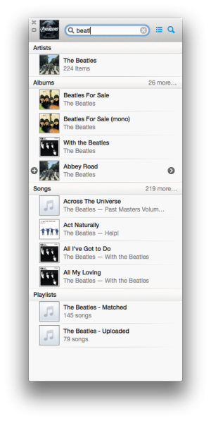
Another big improvement is the new Search Library feature. As soon as you start typing a drop down window starts adding matching titles, broken down into Songs, Albums, Movies, Podcasts, etc. Directly from this window you can add items to Up Next, or access the menu, from which you can change your rating, add to a playlist, etc. This new Search is exceptionally powerful!

iCloud
Apple continue to improve iCloud integration in all its products, and with iTunes 11 you can now stream any content you have purchased from the Store without having to download it first. iTunes will now also sync your place in movies and TV shows, so if you start playing them on your Mac and pause playback, you can then switch to your iPad and pick up the video from right where you left off.

Syncing
Syncing is much the same as before, but the Summary screen gives a lot more information than before. My only complaint that iTunes still seems to lose contact with my iDevices, despite them being on the same Wi-Fi network. This was a bug that I hoped would be fixed in iTunes 11.

Conclusion
I do miss the cover-flow view, and I'm still not sure whether Up Next is as useful as Auto DJ, but overall there is a lot to like about iTunes 11. The new MiniPlayer and Search are both very powerful, and little touches like the Album View are great new features. iTunes may not be for everyone, and many people will be critical of the changes, but overall I like it.

Thanks for reading.


Wednesday, November 28, 2012

Where is the New iTunes?

Update: iTunes 11 is now available for download at this link. I'll post my first impressions soon!
Updated: 2012-11-29

In addition to the iPhone 5, Apple announced at their 12 September event that iTunes would be upgraded in October. Their was even a link on their iTunes homepage for "the new iTunes". October came and went, and the banner was changed to "Coming in November".

I'm a pretty reluctant user of iTunes, but as an iDevice owner, iTunes is a necessary evil. On my Windows 7 machine it is particularly clunky, and I usually have to close it down and re-open it before I can connect any of my devices to sync. It's not all bad, and there are some features that are well thought out, but overall it's not a great user experience. However, the new iTunes will be "dramatically simpler," according to Apple SVP Eddy Cue. In addition to the new features and improved UI, Apple is also promising "improved performance throughout". This gives me hope.

It'll feature a grid user interface. Users can change the order of upcoming tracks within a queue. Search has been upgraded with inline results: one click for information, double-click to play. There's also iCloud integration, and users will be able to watch movies from iCloud.


It sounds like a big change, and I'm hopeful that the delay means that Apple will have all the bugs ironed out before its released, but I'm also getting impatient.

It's the 28th of November today. A Wednesday. The last Wednesday of the month. Apparently iTunes updates have been on Wednesdays more often than any other day of the week. So maybe today is the day, but time is running out, and I'd hate to see that banner change to "Coming in December"!

Thanks for reading.

Tuesday, November 27, 2012

The Microsoft Surface - A Failure in Design?

The Surface tablet is being pushed hard by Microsoft as part of its $1,5bn Windows 8 marketing campaign. Pop-up stores have been set up in shopping malls across the US, hoping to convince holiday shoppers to purchase the Microsoft branded tablet over the Android and Apple competitor devices. Microsoft made a big deal about the design of the hardware, and features like the Kickstand, but I believe the combination of the ill-conceived hardware and the dumbed down version of Windows 8, known as Windows RT, will ultmately fail in the market.

 Microsoft are very proud of the Touch Cover, which uses magnets to attach to the tablet, similar to Apple's Smart Cover, but offers a touch keyboard built in. This turns the Surface into a laptop alternative, except for one key point: it's not lap friendly. The Surface only works well in this configuration when placed on a hard surface, like a desk. It definitely does not work in "lean-back" mode, like when you're on the couch watching TV, which is when I use my iPad the most. Detach the Touch Cover, and the Surface turns into a bulky tablet that feels awkward in portrait mode, due to its 16:9 aspect ratio. And that Kickstand also only works in landscape mode.

The 16:9 display may be better for movies, but I prefer reading in portrit mode on my iPad, and alternate between portrit and landscape depending on specific app designs. Perhaps Microsoft are targeting the Surface to appeal to enterprise first, and I can see how it would be great for taking notes in a meeting, but for $600 (with Touch Cover) there are plenty of more versatile laptops I'd recommend before the Surface. One of the Surface's selling points is that Windows RT comes with a version of Microsoft Office. That might be useful to access files when you're away from your desk, or for inputting data when you're on the road, but anyone that uses Excel for document creation and/or data manipulation will tell you that a 10.6" screen is hopelessly small. So who will the Surface actually appeal to? I'm not sure, and I can't think of a use case where I'd reach for the Surface before the iPad.

Thanks for reading.

Saturday, November 24, 2012

The Problem with Microsoft's Window 8 Strategy

Microsoft have budgeted $1,5 billion for marketing Windows 8, and despite a lot of interest, I haven't read to many positive reviews. Windows 8 comes in many forms, and is part of Microsoft's strategy to revitalize the Redmond Giant's fortunes. Microsoft are traditionally a software company, and Windows has been the most popular operating system in the world for the last 25 years (if not longer). Their Office suite is also used by almost every major company in the world, and is the cornerstone of all enterprise personal computing. So why would they make such a radical change as they have with Windows 8? Simple. Apple. Their competition over at Cupertino introduced the iPhone in 2007 and have grown to be not only the most powerful company in technology, but also the most valuable public company in the world. And so the new strategy was born: copy everything Apple has done.

It started with Windows Phone 7, which got a lot of good reviews for its tile based UI, but didn't catch the imagination of Joe Public. And so Microsoft dumped Phone 7, and re-wrote the OS to create Windows Phone 8, carrying over the UI, but ending the update life of any phones they had managed to sell. Simultaneously they were developing a UI for their new Windows 8 operating system, and this is where they deviated from Apple's strategy, and where I believe they have made a huge mistake!

Apple introduced iOS (originally iPhone OS) in 2007, for the iPhone. In 2010 they adapted it for the first iPad. Apple's operating system for laptops and desktops is known as OS X, and is completely separate. However, following the success of the iPhone and iPad, they have gradually incorporated aspects of iOS into OS X, to take advantage of the "halo" effect of these successful devices. This has worked for them, and Mac usage has steadily increased in a shrinking market.

However, Microsoft did not adapt Windows Phone 8 for use on their tablets, and instead developed a version of Windows 8 (Windows RT) to run on the ARM processors typically used in mobile devices. Their will also be more powerful tablets running x86 processors, and these will use the same version of Windows 8 that will be used on desktops and laptops.

The thinking at Redmond is that there will be a trickle down effect. They practically own the desktop/laptop market, especially in enterprise, so you'll eventually be forced into using a Windows 8 machine. Once that happens, people will automatically purchase tablets and phones running the now familiar UI.

Now this might sound OK, but the problem is that tablets differ hugely from desktops and laptops. Tablets use a touch interface that is just not viable on a desktop and to a lesser extent a laptop. Most of the complaints about Windows 8 on PCs revolves around the new Start screen and the use of the live tiles, the very aspect that get so many complements on phones like the Lumia 920 running WP8. On a PC, the tiles seem misplaced, and are an irritating layer over the traditional desktop screen. On a non-touch screen machine, the UI has become illogical, and requires all sorts of not so obvious mouse actions to navigate.

Microsoft could have easily avoided this with a slightly more cautious approach. The tiles could have perhaps been built into the desktop screen for machines without a touch interface, with the option to turn them off altogether. Instead, they have forced this upon us, and the result: 42% of prospective buyers going Apple, according to a recent survey.

Thanks for reading.


Friday, November 23, 2012

Did You Miss Me?

It's the middle of the Thanksgiving long weekend in the US, and the blogosphere is unusually quiet. Are all the bloggers so stuffed full of turkey, or so busy chasing Black Friday specials, that they don't have the time or inclination to write, or has the whole of Silicon Valley shut down for a well deserved break? This made me think about my own blog, and I was ashamed to see it's been over a year since my last post! Unforgivable!

I would like to commit to writing a little more regularly, and will discuss some of the new technology in my "digital life", as well as comment on some of the tech news that makes the headlines. Hopefully, this, my first blog of 2012, will be the first of many, and I will be able to entertain some of the faithful that have subscribed.

Thanks for reading.