Update: iTunes 11 is now available for download at this link. I'll post my first impressions soon!
Updated: 2012-11-29
In addition to the iPhone 5, Apple announced at their 12 September event that iTunes would be upgraded in October. Their was even a link on their iTunes homepage for "the new iTunes". October came and went, and the banner was changed to "Coming in November".
I'm a pretty reluctant user of iTunes, but as an iDevice owner, iTunes is a necessary evil. On my Windows 7 machine it is particularly clunky, and I usually have to close it down and re-open it before I can connect any of my devices to sync. It's not all bad, and there are some features that are well thought out, but overall it's not a great user experience. However, the new iTunes will be "dramatically simpler," according to Apple SVP Eddy Cue. In addition to the new features and improved UI, Apple is also promising "improved performance throughout". This gives me hope.
It'll feature a grid user interface. Users can change the order of upcoming tracks within a queue. Search has been upgraded with inline results: one click for information, double-click to play. There's also iCloud integration, and users will be able to watch movies from iCloud.
It sounds like a big change, and I'm hopeful that the delay means that Apple will have all the bugs ironed out before its released, but I'm also getting impatient.
It's the 28th of November today. A Wednesday. The last Wednesday of the month. Apparently iTunes updates have been on Wednesdays more often than any other day of the week. So maybe today is the day, but time is running out, and I'd hate to see that banner change to "Coming in December"!
Thanks for reading.
Wednesday, November 28, 2012
Tuesday, November 27, 2012
The Microsoft Surface - A Failure in Design?
Microsoft are very proud of the Touch Cover, which uses magnets to attach to the tablet, similar to Apple's Smart Cover, but offers a touch keyboard built in. This turns the Surface into a laptop alternative, except for one key point: it's not lap friendly. The Surface only works well in this configuration when placed on a hard surface, like a desk. It definitely does not work in "lean-back" mode, like when you're on the couch watching TV, which is when I use my iPad the most. Detach the Touch Cover, and the Surface turns into a bulky tablet that feels awkward in portrait mode, due to its 16:9 aspect ratio. And that Kickstand also only works in landscape mode.
The 16:9 display may be better for movies, but I prefer reading in portrit mode on my iPad, and alternate between portrit and landscape depending on specific app designs. Perhaps Microsoft are targeting the Surface to appeal to enterprise first, and I can see how it would be great for taking notes in a meeting, but for $600 (with Touch Cover) there are plenty of more versatile laptops I'd recommend before the Surface. One of the Surface's selling points is that Windows RT comes with a version of Microsoft Office. That might be useful to access files when you're away from your desk, or for inputting data when you're on the road, but anyone that uses Excel for document creation and/or data manipulation will tell you that a 10.6" screen is hopelessly small. So who will the Surface actually appeal to? I'm not sure, and I can't think of a use case where I'd reach for the Surface before the iPad.
Thanks for reading.
Saturday, November 24, 2012
The Problem with Microsoft's Window 8 Strategy
Microsoft have budgeted $1,5 billion for marketing Windows 8, and despite a lot of interest, I haven't read to many positive reviews. Windows 8 comes in many forms, and is part of Microsoft's strategy to revitalize the Redmond Giant's fortunes. Microsoft are traditionally a software company, and Windows has been the most popular operating system in the world for the last 25 years (if not longer). Their Office suite is also used by almost every major company in the world, and is the cornerstone of all enterprise personal computing. So why would they make such a radical change as they have with Windows 8? Simple. Apple. Their competition over at Cupertino introduced the iPhone in 2007 and have grown to be not only the most powerful company in technology, but also the most valuable public company in the world. And so the new strategy was born: copy everything Apple has done.
It started with Windows Phone 7, which got a lot of good reviews for its tile based UI, but didn't catch the imagination of Joe Public. And so Microsoft dumped Phone 7, and re-wrote the OS to create Windows Phone 8, carrying over the UI, but ending the update life of any phones they had managed to sell. Simultaneously they were developing a UI for their new Windows 8 operating system, and this is where they deviated from Apple's strategy, and where I believe they have made a huge mistake!
Apple introduced iOS (originally iPhone OS) in 2007, for the iPhone. In 2010 they adapted it for the first iPad. Apple's operating system for laptops and desktops is known as OS X, and is completely separate. However, following the success of the iPhone and iPad, they have gradually incorporated aspects of iOS into OS X, to take advantage of the "halo" effect of these successful devices. This has worked for them, and Mac usage has steadily increased in a shrinking market.
However, Microsoft did not adapt Windows Phone 8 for use on their tablets, and instead developed a version of Windows 8 (Windows RT) to run on the ARM processors typically used in mobile devices. Their will also be more powerful tablets running x86 processors, and these will use the same version of Windows 8 that will be used on desktops and laptops.
The thinking at Redmond is that there will be a trickle down effect. They practically own the desktop/laptop market, especially in enterprise, so you'll eventually be forced into using a Windows 8 machine. Once that happens, people will automatically purchase tablets and phones running the now familiar UI.
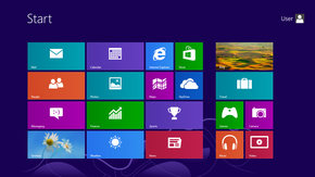
Now this might sound OK, but the problem is that tablets differ hugely from desktops and laptops. Tablets use a touch interface that is just not viable on a desktop and to a lesser extent a laptop. Most of the complaints about Windows 8 on PCs revolves around the new Start screen and the use of the live tiles, the very aspect that get so many complements on phones like the Lumia 920 running WP8. On a PC, the tiles seem misplaced, and are an irritating layer over the traditional desktop screen. On a non-touch screen machine, the UI has become illogical, and requires all sorts of not so obvious mouse actions to navigate.
Microsoft could have easily avoided this with a slightly more cautious approach. The tiles could have perhaps been built into the desktop screen for machines without a touch interface, with the option to turn them off altogether. Instead, they have forced this upon us, and the result: 42% of prospective buyers going Apple, according to a recent survey.
Thanks for reading.
It started with Windows Phone 7, which got a lot of good reviews for its tile based UI, but didn't catch the imagination of Joe Public. And so Microsoft dumped Phone 7, and re-wrote the OS to create Windows Phone 8, carrying over the UI, but ending the update life of any phones they had managed to sell. Simultaneously they were developing a UI for their new Windows 8 operating system, and this is where they deviated from Apple's strategy, and where I believe they have made a huge mistake!
Apple introduced iOS (originally iPhone OS) in 2007, for the iPhone. In 2010 they adapted it for the first iPad. Apple's operating system for laptops and desktops is known as OS X, and is completely separate. However, following the success of the iPhone and iPad, they have gradually incorporated aspects of iOS into OS X, to take advantage of the "halo" effect of these successful devices. This has worked for them, and Mac usage has steadily increased in a shrinking market.
However, Microsoft did not adapt Windows Phone 8 for use on their tablets, and instead developed a version of Windows 8 (Windows RT) to run on the ARM processors typically used in mobile devices. Their will also be more powerful tablets running x86 processors, and these will use the same version of Windows 8 that will be used on desktops and laptops.
The thinking at Redmond is that there will be a trickle down effect. They practically own the desktop/laptop market, especially in enterprise, so you'll eventually be forced into using a Windows 8 machine. Once that happens, people will automatically purchase tablets and phones running the now familiar UI.
Now this might sound OK, but the problem is that tablets differ hugely from desktops and laptops. Tablets use a touch interface that is just not viable on a desktop and to a lesser extent a laptop. Most of the complaints about Windows 8 on PCs revolves around the new Start screen and the use of the live tiles, the very aspect that get so many complements on phones like the Lumia 920 running WP8. On a PC, the tiles seem misplaced, and are an irritating layer over the traditional desktop screen. On a non-touch screen machine, the UI has become illogical, and requires all sorts of not so obvious mouse actions to navigate.
Microsoft could have easily avoided this with a slightly more cautious approach. The tiles could have perhaps been built into the desktop screen for machines without a touch interface, with the option to turn them off altogether. Instead, they have forced this upon us, and the result: 42% of prospective buyers going Apple, according to a recent survey.
Thanks for reading.
Friday, November 23, 2012
Did You Miss Me?
It's the middle of the Thanksgiving long weekend in the US, and the blogosphere is unusually quiet. Are all the bloggers so stuffed full of turkey, or so busy chasing Black Friday specials, that they don't have the time or inclination to write, or has the whole of Silicon Valley shut down for a well deserved break? This made me think about my own blog, and I was ashamed to see it's been over a year since my last post! Unforgivable!
I would like to commit to writing a little more regularly, and will discuss some of the new technology in my "digital life", as well as comment on some of the tech news that makes the headlines. Hopefully, this, my first blog of 2012, will be the first of many, and I will be able to entertain some of the faithful that have subscribed.
Thanks for reading.
I would like to commit to writing a little more regularly, and will discuss some of the new technology in my "digital life", as well as comment on some of the tech news that makes the headlines. Hopefully, this, my first blog of 2012, will be the first of many, and I will be able to entertain some of the faithful that have subscribed.
Thanks for reading.
Thursday, October 27, 2011
Is iOS 5 A Disappointment?
iOS 5 was a huge update for iPhone and iPad users, with more than 200 new features, including some that had been major requests for some time, and also dozens of smaller, "nice-to-haves" that make the iPhone and iPad such compelling devices. I was among the millions that downloaded the new iOS on the day it was released, 12 October 2011. In fact, so many people were trying to download it simultaneously that they nearly brought down the internet! As good as it is, iOS 5 isn't perfect. Having lived with it for a couple of weeks now, I thought I would just list a couple of little niggles I have. Note, this is not a review of the iPhone 4S, but rather iOS 5 used as an update to iPhone 4.
Notification Center
This is one of the most sought after features, and the one I was looking forward to the most, having used Android previously. Apple have done a great job, and have improved on Android's offering, but is it too much to ask to include a "clear all" button? It's great that you have the option to clear the notifications from each app individually, but if you haven't checked it all day it can be quite tiresome. One button to get rid of all those stale notifications is a must-have!
iMessage
For this one Apple looked across the border to RIM to copy their hugely successful Blackberry Messaging service. The intention was great, and the integration with the SMS Messages feature is typical of Apple's seamless approach to software design. The problem is, most of my friends don't have iPhones. I am working on that, but in the last 2 weeks I have not used iMessage once. If Samsung can make messaging cross-platform with their soon to be released ChatON service, why couldn't Apple? For now I continue to use Whatsapp.
Newsstand
My only complaint about Newsstand is that there is no way to hide or delete the Newsstand "folder" if you don't use it. It's faux wood shelves are an unnecessary blot on my pristine iPhone screen! Sure, there is a way to add it into another folder, but this is a work around, and it shouldn't be necessary.
Reminders
I like the Reminders app, but one of its best features is practically unusable! The ability to add a location to a reminder is great, in theory. Unfortunately, Apple only allows you to add addresses from your Contacts, and I cannot get iOS to recognise my work or home addresses, and I don't have the addresses of shopping centers in my Contacts! Why couldn't Apple just allow the option to set the location by dropping a pin on the map?
Photos
iOS brings with it some great improvements for the Camera app, including the ability to go to the Camera app straight from the lock-screen, and to use the volume "up" button as a shutter release. However, the new Photo Stream feature hasn't been fully thought through. In theory it's great! All your photos will be instantly synced to all your iOS devises so if, for example, you shoot a picture with your iPhone, you can use the bigger screen on the iPad to touch it up, and then share it to Twitter from there. Awesome! But what if you're out shopping, and you shoot a photo of the latest Iron Man toy so you can check with your wife whether it's an appropriate Christmas present for your kid, and the kid picks up your iPad to play Angry Birds? Bam! Surprise ruined! The photo streaming idea is great, but it should require some user input for each photo before syncing, and perhaps even a list of devices you want to share it with.
Wi-Fi Sync
This is one of the other features I was really looking forward to. For me it just doesn't work consistently and I have no idea what I'm doing wrong. It has worked, but most days I see a message to say "incomplete sync", or for whatever reason the iPhone isn't being recognised by iTunes, despite them both being able to access the internet on the same Wi-Fi connection.
Missing features
There are still a number of basic features that Apple seem to continuously overlook. Two of the biggest for me have to do with the newly renamed Music app. I have an old iPod Nano, and it had a feature that allowed me to set a playlist as an alarm. Thus I could wake up to the music of my choice each day. There are apps that try to imitate this, but most require you to open the app and leave it running all night, which is far from ideal. In a similar vein, why is there no sleep mode. If I using my iPhone to play music through a dock, I should be able to set it to turn off after 20 minutes. These aren't sophisticated features, and it amazes me that they aren't included in iOS. Even iTunes doesn't have a sleep function, which is ridiculous!
Wow, when I list my problems like this, there are more than I thought. This may make it sound like I'm unhappy with iOS 5, but I'm not! It's a huge step up from iOS 4.3, and I wouldn't switch back for anything. I'm just a bit disappointed, because it could have been so much better!
Thanks for reading.

Notification Center
This is one of the most sought after features, and the one I was looking forward to the most, having used Android previously. Apple have done a great job, and have improved on Android's offering, but is it too much to ask to include a "clear all" button? It's great that you have the option to clear the notifications from each app individually, but if you haven't checked it all day it can be quite tiresome. One button to get rid of all those stale notifications is a must-have!
iMessage
For this one Apple looked across the border to RIM to copy their hugely successful Blackberry Messaging service. The intention was great, and the integration with the SMS Messages feature is typical of Apple's seamless approach to software design. The problem is, most of my friends don't have iPhones. I am working on that, but in the last 2 weeks I have not used iMessage once. If Samsung can make messaging cross-platform with their soon to be released ChatON service, why couldn't Apple? For now I continue to use Whatsapp.
Newsstand
My only complaint about Newsstand is that there is no way to hide or delete the Newsstand "folder" if you don't use it. It's faux wood shelves are an unnecessary blot on my pristine iPhone screen! Sure, there is a way to add it into another folder, but this is a work around, and it shouldn't be necessary.
Reminders
I like the Reminders app, but one of its best features is practically unusable! The ability to add a location to a reminder is great, in theory. Unfortunately, Apple only allows you to add addresses from your Contacts, and I cannot get iOS to recognise my work or home addresses, and I don't have the addresses of shopping centers in my Contacts! Why couldn't Apple just allow the option to set the location by dropping a pin on the map?
Photos
iOS brings with it some great improvements for the Camera app, including the ability to go to the Camera app straight from the lock-screen, and to use the volume "up" button as a shutter release. However, the new Photo Stream feature hasn't been fully thought through. In theory it's great! All your photos will be instantly synced to all your iOS devises so if, for example, you shoot a picture with your iPhone, you can use the bigger screen on the iPad to touch it up, and then share it to Twitter from there. Awesome! But what if you're out shopping, and you shoot a photo of the latest Iron Man toy so you can check with your wife whether it's an appropriate Christmas present for your kid, and the kid picks up your iPad to play Angry Birds? Bam! Surprise ruined! The photo streaming idea is great, but it should require some user input for each photo before syncing, and perhaps even a list of devices you want to share it with.
Wi-Fi Sync
This is one of the other features I was really looking forward to. For me it just doesn't work consistently and I have no idea what I'm doing wrong. It has worked, but most days I see a message to say "incomplete sync", or for whatever reason the iPhone isn't being recognised by iTunes, despite them both being able to access the internet on the same Wi-Fi connection.
Missing features
There are still a number of basic features that Apple seem to continuously overlook. Two of the biggest for me have to do with the newly renamed Music app. I have an old iPod Nano, and it had a feature that allowed me to set a playlist as an alarm. Thus I could wake up to the music of my choice each day. There are apps that try to imitate this, but most require you to open the app and leave it running all night, which is far from ideal. In a similar vein, why is there no sleep mode. If I using my iPhone to play music through a dock, I should be able to set it to turn off after 20 minutes. These aren't sophisticated features, and it amazes me that they aren't included in iOS. Even iTunes doesn't have a sleep function, which is ridiculous!
Wow, when I list my problems like this, there are more than I thought. This may make it sound like I'm unhappy with iOS 5, but I'm not! It's a huge step up from iOS 4.3, and I wouldn't switch back for anything. I'm just a bit disappointed, because it could have been so much better!
Thanks for reading.
Monday, October 10, 2011
A Great iPhone Dock
I have long had a mini hi-fi in my bedroom, and for the last 10 years my Onkyo that I bought in Japan has served me well. Initially, I bought it to play mini-discs, which were hugely popular in Japan before mp3s became the the force de jour. However, the Onkyo was versatile, and the “Aux In” allowed me to connect my iPod with relative ease. Unfortunately, the power supply recently packed up, and I decided it was time for an upgrade.
My requirements were simple:
- iPod/iPhone capable
- Good sound, but high volume not an issue
- Solid build
- Subtle styling
- Reasonable price
The dock handles iPods and iPhones with a 30-pin Dock Connector, but there is also an auxiliary input for those other media players. The minimalistic design means the only buttons are volume up and down - the unit has auto power on and off, which is ideal for me. I can set the alarm on my iPod to play a specific playlist, and wake up to my favourite music, without having to leave the unit switched on all night. It works like a charm! There is no need for a "mode" switch - the unit will play from whichever source is connected, and will play from both simultaneously if both are connected. Included in the box is a very basic remote, which unfortunately feels a bit cheap, but gets the job done.
Priced at $169.99 from Amazon, but available for as little as $123 if you Google it, I was able to find one in South Africa at R1,770, after tax and duties, which wasn't too bad. Thanks to the great staff at Audio Excellence on Umhlanga Ridge for your patience and assistance!
Thanks for reading!
Thursday, October 6, 2011
Subscribe to:
Posts (Atom)