Thursday, June 20, 2013

Goodbye Google Reader, Hello Feedly and Digg


Google Reader was introduced through Google Labs on October 7, 2005. Since then it has become the dominant RSS feed reader on the web, and is the go-to web app for millions of people around the world. Such is its dominance, that alternative readers have long since abandoned the cause. It is especially popular among tech journalists, who use the service to ensure they monitor all their online sources for every bit of news.

I have been using Google Reader since February 6, 2007, and in that time I have read an astonishing 236,470 articles - a little over 100 articles every day!

On March 13, 3013, Google announced that it would be closing Reader on July 1, 2013, due to declining use. This is the sad reminder that greets us when you open Reader now:


For some reason, Google have never offered a compelling mobile app for Reader, but many developers have launched apps that use the Google Reader backend. Reeder, Feedly, and my personal choice, Mr. Reader, are some of the leading iOS apps in this market.

Feedly has been hard at work to introduce its own service to replace Google Reader, and interestingly, has seen its user base jump from 4 million to 12 million since Google's March announcement. Unfortunately, the "new" Google measures users in hundreds of millions, so these figures apparently are insufficient for them to retain an interest in the sector. Perhaps Google thinks users will flock to Google +, but for me Google + doesn't have the focus of a good RSS reader. Perhaps apps like Flipboard and Zite can offer similar content, but neither one allows me to scan through articles with the same speed.

So where do users go?

The aforementioned Feedly yesterday announced via their blog the introduction of Feedly Cloud, and the Feedly web app which offers a very similar service to Google Reader. Users can now migrate their feeds from Reader over to Feedly Cloud, and they have already been approached by more than 200 developers since they announced their API.


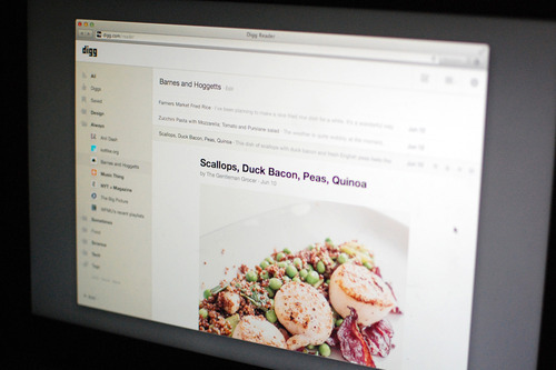
Similarly, the team at Digg have been hard at work building their app, to be called Digg Reader (of course). In their blog they announced that they will be rolling out Version 1 shortly, but have promised everyone will have access by June 26. They will also offer migration from Google Reader, and their interface looks very clean and simple. Mobile apps are in development, and will offer cloud syncing. The service will be following the freemium model, but the team have said that all the features offered at launch will remain free. You can register for the service here.

For now, these 2 are the frontrunners for replacing Google Reader, and both offer plenty of promise. For the RSS faithful, this may even be a blessing in disguise. Google gave up on developing Reader long before their March announcement. The last update to the interface was on October 31, 2011, as part of the visual redesign of all Google products in 2011. The renewed competition in the sector might lead to some new innovation, and as consumers we should benefit.

Goodbye Google Reader, we hardly knew you.


Thanks for reading.


Tuesday, June 18, 2013

Why iOS 7 Is Going To Be Awesome

Apple is a company like no other. Love them or hate them, you have to admire their courage. How many companies with a product as successful as iOS would dare to disrupt themselves? And yet that is what they have done. The original version of iPhone OS was revealed in January 2007, and over the last 6 years it has been developed to a point of near perfection.

In October 2012 Apple announced  that "Jony Ive will provide leadership and direction for Human Interface (HI) across the company in addition to his role as the leader of Industrial Design." Jony clearly had an idea of where he wanted to take iOS, and that just wasn't possible as a mere iteration of iOS 6. For a designer, there comes a time when there are things you want to do that you can't, and your only option is to tear down the exisiting structure and start again. The version of iOS 7 that was revealed at WWDC is the result of that rebuild, and although it is labelled a Beta version, it is very clearly incomplete. Considering that the development team had less than 8 months, it is truly remarkable that they had anything to show at all!

At the keynote at WWDC, Apple concentrated on the features of the new design that were fit for the general public. The tech press have been less than enthusiastic, with most criticism directed at the colour palette and design of the icons. However, the developers that attended the sessions that followed, which are unfortunately protected by NDA, are hugely positive. Why the difference in opinion?

If we break it down into it's various components the picture is clearer:

Concept
Gone are the faux leather and felt; replaced by translucency, animations, and layers. The structure of the UI make more sense: the layers are functional and hierarchical. The translucency gives a sense of place and an almost three-dimensional appearance, and the animations make it all more engaging. Despite all the changes, however, the UI remains familiar and intuitive, and isn't such a big departure from iOS 6 that it would confuse or disorientate current users.


Design
Unfortunately, the design is the let-down. The use of neon colours is painful, and the icons, while definitely "flatter", are confusingly inconsistent. Ian Storm Taylor has a great breakdown here. The good news is that many of these problems can be corrected before iOS 7 is released to the public in September, although it may be too late to change the colour palette as this has already been released to the developers as a design guide.

Features
Possibly the biggest new feature is Control Center. Swiping up from any screen, including the lock-screen, brings up one-tap access to to do things like switch to Airplane mode, turn Wi-Fi on or off, or adjust the brightness of your display. This has been a much requested feature, and while Android fans may denounce it, the implementation is far better than on any Android device I have seen.

The update to Notification Center also now includes access from the lock-screen, and adds a "Today" tab that is somewhat familiar to Google Now. It will be interesting to see what functionality Apple adds.

Multitasking is another big change. Visually, there are now preview screens of each app, and to quit them you just swipe it up. However, the bigger change is that iOS 7 now updates your apps in the background, based on your usage. Gone, hopefully, are the days of waiting for Twitter or Facebook to refresh each time you open it. Apple claim they can schedule these updates intelligently, so as not to unnecessarily drain your battery.

The Camera app has been updated to add filters, and the Photo app adds collections, similar to iPhoto. AirDrop allows easy sharing to other iOS devices, and Safari now includes iCloud Keychain to remember your account names, passwords, and credit card numbers across devices, including OS X.

Finally, Apple have introduced iTunes Radio music streaming (for US only), and as expected it'll be free with ad support, or without ads for Match subscribers.

Developers
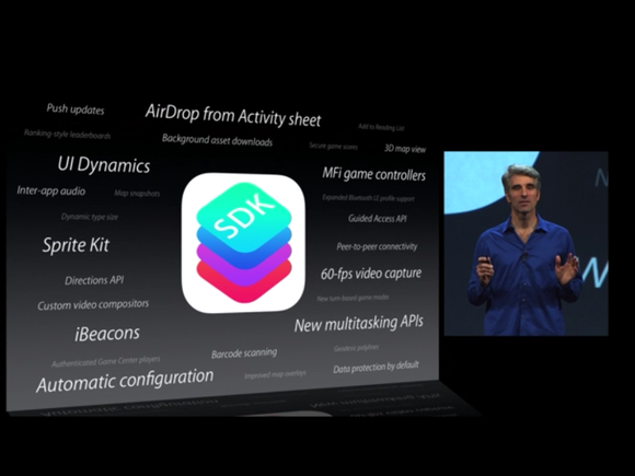
Apple have made more than 1500 new developer APIs available, and the reaction from developers has been overwhelmingly positive. As previously mentioned, most of the detail is protected by NDAs, but iBeacon for microlocation using Bluetooth, MFi Game Controllers, and the Xcode 5 app builder were amongst the new features publicly announced, and have no doubt given the developers lots of additional new tools to work with.

Future
To see iOS 7 as merely a set of brightly coloured icons is very short-sighted. iOS 7 is the start of a new design direction for Apple, and they have constructed the tools and established the parameters to start the development of a new generation of apps. I am sure we will see a lot more to iOS 7 when it is released later this year, and I'm excited about the new features Jony Ive and the software development team will introduce in later updates in the years to come. As with previous versions, Apple will continue to iterate; the hard work has been done, the new platform has been set, and the polish and magic will come.

Thanks for reading.


Sunday, June 9, 2013

WWDC And The Importance of iOS 7

On Monday, 10 June, the annual gathering of Apple's developers kick's off with CEO Tim Cook's keynote speech at 10:00 PST in San Francisco's Moscone Center.

As usual, there is a huge amount of excitement surrounding the event, and rumours of what might or might not be announced have dominated the tech news for the last few weeks. Being a developer's conference, the focus is on software, rather than hardware. Few expect new iPhone or iPad announcements, although Apple might use the event to preview updates to the MacBook line, with updates to the Haswell line of processors most likely. There might even be an announcement regarding the US manufacture of a new, and long overdue Mac Pro. An announcement regarding the release of OS X 10.9 is also expected, but the changes will be more likely be evolutionary, rather than revolutionary.

Apple and Wall Street
From a high of 705 in September 2012, after the launch of the iPhone 5, the Apple share price plummeted to a low of 385 in April of this year. Since the announcement of the share buy-back scheme, the has been some improvement, and the shares are trading in the 440 - 450 band this week. This is enough to still make Apple the most valuable tech company in the world, with a market cap of over $415bn.

One of the main reasons for this high value is the above average margins Apple makes on its products. In March 2012 Apple's gross margin was 47,37%, but this fell to 37,5% by March 2013 (link). However, Apple's net profit for the year ending March 2013 was $39,5bn, compared to $38,5bn for the previous year (link). So, despite a reduced profit margin, net profit increased. This is due to the increased sales of Apple products, as they push into more and more markets around the world.

So why the volatility in the share price? Analysts are nervous that the iPhone and iPad, Apple's two main sources of revenue, are losing their appeal. If sales drop off, the net profit falls, as there is little to no room to increase margins.

The Importance of iOS 7

The real importance of iOS 7 will therefore be how Apple adds value to the ecosystem that has grown around the iPhone and iPad, and convinces the buying public to continue paying a premium for Apple products. In short, Apple needs to add new features that will retain its current users and attract new customers.

iOS today looks almost the same as it did back in 2007 when Steve Jobs announced the iPhone more than 6 years ago in the same venue. As competition in the segment has grown, other smartphone manufacturers have added widgets and newsfeeds to their home screens, and the iOS grid of icons has grown stale. One update that we might see will be an update to Notification Center, and the inclusion of more widgets, beyond the weather and stock ticker. There has been a lot of speculation about Sir Jony Ive's "flattening" of iOS and the move away from skeuomorphism (digital interfaces that replicate the physical look), and the "modernisation" of iOS will be a very welcome move.

Key new features could include the facilitation of mobile payments through Passbook, the free but ad supported "iRadio" music streaming service linked to iTunes, and possibly the release of more API's for Siri and iCloud to developers, which could lead to the development of new apps that take advantage of these features.

One More Thing

Steve Jobs was famous for his "one more thing" announcements in his keynote speeches. While Tim Cook is unlikely to copy his predecessor exactly, there is also speculation that Apple might announce a move into "wearable" technologies, perhaps the "iWatch".

I am also hopeful that Apple's "hobby" project, the Apple TV, might get some love. Opening that platform up to developers would be a big move, especially for the gaming community.

Thanks for reading.


Saturday, June 1, 2013

Is the Windows PC Doomed?

The "post-PC era" predicted by Steve Jobs at the launch of the iPad 2 in 2011 referred to the move from desktop/laptop to smartphone/tablet, and the research agency IDC has confirmed this trend; tablet shipments will exceed those of portable PCs this year and will exceed all PC shipments by 2015.

This must be a huge concern to Microsoft. All their traditional markets are receding, and they are struggling to get a foothold in the tablet market. The Surface RT has been a failure, and while there might be some demand for the Surface Pro, it's not nearly enough to offset the loss of sales in the laptop market.

I believe that Microsoft's marketing and product strategy might be flawed. Originally, it seemed like they might be on the right track. Commonise the look across their PCs, tablet and smartphones, and add touch to everything. It worked for Apple, right? Not quite. The requirements for work are very different to the requirements for personal. Like millions of people, I have a Windows PC at work that I am chained to for 8 hours a day. I despise that machine. After plugging away in Excel, it's a pleasure to switch to iOS for my personal needs. I seldom need Excel or Word in my personal life; Google docs will suffice in most cases. I don't want to have the same experience as on my work machine. Microsoft thought that people wanted familiarity, but in actual fact I think people want the opposite.

Microsoft are making the right move with Windows Blue, or 8.1, especially allowing users to boot to the desktop. My company will skip W8 altogether if it boots to a start screen full of social networking apps! 8.1 will bring W8 into enterprise, and I expect we'll see an increase in sales. Microsoft should concentrate on the enterprise market; a stable and secure OS and their dominant Office Suite. Their problem is that the desktop/laptop market has matured to a point where there is not a pressing need to update your system every couple of years anymore. In contrast, tablets are still evolving, and new technologies are helping manufacturers cut weight without sacrificing battery life. My 3rd generation iPad is awesome, but the iPad 5 will be very tempting!

However, I don't see tablets replacing desktops or laptops in enterprise anytime soon. People may use tablets for some tasks, but more for note taking, email, etc. Even if I could use Excel on my iPad, I would still need a PC to do the heavy lifting. For the foreseeable future there will still be  a need for Windows PCs, and Microsoft may be losing some of the consumer market, and the replacement cycle in enterprise has increased, but there is still some life left for the PC.

Wednesday, December 19, 2012

Apple's Memory Storage Rip-off


What is the true cost of memory? According to Apple, it's very expensive. The iPhone, iPad and iPad mini come in 3 memory storage capacities: 16GB, 32GB and 64GB. The devices are otherwise identical. The table below shows the pricing of the iPad for each capacity:


Apple's on-cost for increased memory is consistant across all the device ranges:
16GB --> 32GB: $100.00 equivalent to $6.25/GB
32GB --> 64GB: $100.00 equivalent to $3.13/GB

However, if we look at the cost of SanDisk Memory Cards, the on-cost is much less (from Amazon.com):
16GB --> 32GB: $10.00 equivalent to $0.63/GB
32GB --> 64GB: $30.00 equivalent to $0.94/GB


This is an incredible rip-off! Based on the above, Apple is charging 1,000% more for the step up from 16GB to 32GB than SanDisk do on Amazon.com. And I'm not even using the sales prices quoted on the site. I know this is not the most accurate way to calculate what memory actually costs, but I don't have access to Apple's BOM. I also have enough understanding of marketing to understand that products are sold at what the market will accept, and that product range steps are artificially created to create demand. However, I personally think that $100.00 for 16GB or even 32GB is way more than it needs to be.

Thanks for reading.

Thursday, December 6, 2012

The Digital Land Grab

Apple have often been criticised for their closed ecosystem; the so-called "walled garden" that discourages cross-platform inter-operability. However, developing an ecosystem where the hardware and software is strictly controlled and designed to work together, and where different devices seamlessly connect and interact,  has paid off for Apple, and Microsoft and Google are quietly developing ecosystems of their own. The table below shows the devices each company has developed in an effort to take over your digital life.


 I could have included other companies, like Samsung and Sony, but they mostly run licensed operating systems on their devices. There is a certain degree of cross platform inter-operability between these devices. For example, there is an iOS app that gives remote functionality for the Google TV, and it is still possible to run iTunes on a Windows machine, and thus stream video to an Apple TV via AirPlay.  Apple tends to develop proprietary standards, making it impossible, for example, to stream video from an Android device to Apple TV. Apple does this for 3 reasons:

  1. Security - Apple is very careful about allowing other devices to connect to its ecosystem, thus preventing viruses from spreading.
  2. The Halo Effect - Building on its huge iPhone user-base  Apple can promote their complimentary devices which further enhance the user experience.
  3. Licence fees - Apple can collect licence fees from hardware manufacturers looking to incorporate features like AirPlay into the devices.

Google takes an almost opposite view, and promotes the use of open standards which allows other hardware manufacturers to easily build devices that interact with each other within the Google ecosystem.
The reason for this is because Apple and Google have very different business models. Apple make premium hardware devices, and make their profit from the huge margins they charge. On the other hand, Google make most of their profits from advertising, and anything that gets people online is to their advantage. However, this seems to be changing. With the success of the Nexus 7 tablet, and more recently the Nexus 4 mobile phone, Google are reportedly looking into sourcing their own Chromebooks to complement those already made by Acer and Samsung.

Microsoft is traditionally a software company, and except for the Xbox, their previous attempts at hardware have ended in failure. Both the Zune (mp3 player) and Kin (phone) were short-lived. With the Surface, Microsoft are making an aggressive attack on the tablet market. Time will tell if they are successful or not, but Microsoft are worried. They are seeing their traditional business being eroded from one side by Google, and from the other side by Apple. Google are offering free web-based alternatives to the MS Office Suite, and the Chromebook could eventually challenge their dominance in the PC market. At the same time, Apple's iPad is being seen as an alternative in the post-PC era, and there are many productivity apps in the App Store that also eventually offer an alternative to Office. The Apple Mac is also showing some growth in an otherwise shrinking market. Microsoft therefore feel they have to develop their own ecosystem, and try and find new profit channels like apps from the Windows Store, and subscription services like Office 365.
This 3-way battle is essentially a land grab, because all 3 companies will try and lock users into their respective ecosystems. Apple is leading at the moment, Google has the most flexibility, and Microsoft has the most to lose.

I am a huge fan of Google, and have been a longtime Windows user, but ever since I switched to an iPhone I have been drawn further and further into Apple's "walled garden"; I now have an iPad 3 and a latest generation Apple TV. I have been hugely disappointed in Windows 8, so I'm now considering switching to one of the new iMacs as my main home machine. I still use Gmail, Google Calendar, Google Docs, etc, and I will continue to use my 18 month old Windows 7 laptop until I can afford to replace it, but more and more I look to Apple for my digital fix. Which ecosystem do you use?

Thanks for reading.

Saturday, December 1, 2012

iTunes 11 Hands On Review

After delaying for a month, Apple finally released iTunes 11 on Thursday, 29 November, in both Mac and Windows versions. While many were hoping for a complete re-write, iTunes 11 is only a re-skinning of iTunes 10. Most of the old menus are carried over, although they are mostly hidden from view. The reason for this is Apple have dramatically simplified the UI, and iTunes brings a minimalistic, edge-to-edge design that is more in line with the iOS Music player, and is in-line with their policy of closing the gap between iOS and OS X. The iTunes Store has undergone a similar re-design, and now looks very similar to the App Store on the iPhone and iPad.

Over the years Apple have added more and more functionality to iTunes, and what started off as a simple music player has grown into a do-it-all media player and Store that is often criticised for being bloated and clunky. This latest version simplifies the UI, removing many features power users will miss, but does little to address the bloat of the underlying software.

Menus
In its default configuration the Menu Bar, Sidebar and Status Bar are all hidden from view, but are easily restored. From the little icon in the top left corner select "Show Menu Bar", then select "View" on the Menu Bar and select "Show Sidebar" and "Show Status Bar".

Up Next
I was a big user of the Auto DJ feature, and that too is gone, replaced by the new "Up Next". I mostly listen to playlists ordered by "least recently played", and with "live updating" turned on. Used in conjunction with Auto DJ this gave me a never ending flow of music depending on the playlist, which I could interrupt by inserting individual songs or albums as I chose. Depending on the settings chosen, the main window would then show me a brief history of what played recently, and what songs were scheduled next. The Up Next feature is accessed from an icon in the header, which opens a drop-down window which shows the 20 forthcoming songs. There is a little clock icon which, when clicked, will show your history. For some reason, the history view doesn't include the album art like it does in the forthcoming view. The Up Next window does allow you to re-order or delete songs, but this is not really a new feature, as it was available in Auto DJ.

Views

The "View" options for the main window vary depending on which Library you are looking at. The most obvious change is that cover-flow has been retired. The list view is a very drab grey-on-grey without it. The grid view shows a grid view of the album art, and when you click on an album it expands to show a list of the songs on the left, and the album art on the right. In a very nice, typically Apple touch, the background colour is adjusted according to the colour of the artwork, giving the impression you are looking at the CD cover folded flat. From this view you can easily add complete albums or individual songs into the Up Next queue. Unfortunately, this view can't be used as the "Now Playing" view in the main window.

The grid view in the other Libraries has also lost the ability to re-size the artwork. In Movies, this is particularly annoying, as the artwork is quite big, so you have to do quite a lot of scrolling if you have a large collection.

Overall, the new views are a great way to search for the media you might want to play, but not quite as good as iTunes 10 was for displaying it. I did discover that double clicking the artwork in the header brought up a new window showing the album art, that also doubles as a mid-sized player. Mouse over the artwork brings up play and volumes controls. Nice!

Mini Player
One of the big improvements in iTunes 11 is the MiniPlayer, which now also features search, as well as the icon to bring up the Up Next window. In this view the Up Next window doesn't disappear when you click somewhere else on the screen.

Search
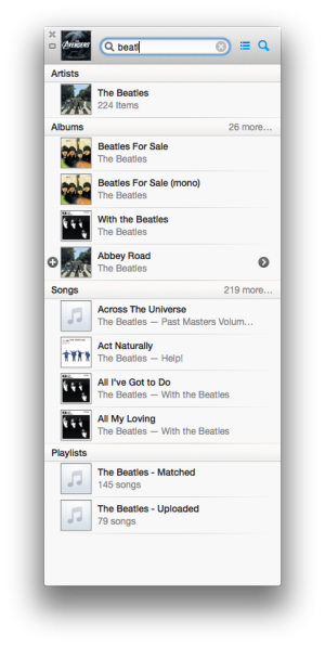
Another big improvement is the new Search Library feature. As soon as you start typing a drop down window starts adding matching titles, broken down into Songs, Albums, Movies, Podcasts, etc. Directly from this window you can add items to Up Next, or access the menu, from which you can change your rating, add to a playlist, etc. This new Search is exceptionally powerful!

iCloud
Apple continue to improve iCloud integration in all its products, and with iTunes 11 you can now stream any content you have purchased from the Store without having to download it first. iTunes will now also sync your place in movies and TV shows, so if you start playing them on your Mac and pause playback, you can then switch to your iPad and pick up the video from right where you left off.

Syncing
Syncing is much the same as before, but the Summary screen gives a lot more information than before. My only complaint that iTunes still seems to lose contact with my iDevices, despite them being on the same Wi-Fi network. This was a bug that I hoped would be fixed in iTunes 11.

Conclusion
I do miss the cover-flow view, and I'm still not sure whether Up Next is as useful as Auto DJ, but overall there is a lot to like about iTunes 11. The new MiniPlayer and Search are both very powerful, and little touches like the Album View are great new features. iTunes may not be for everyone, and many people will be critical of the changes, but overall I like it.

Thanks for reading.